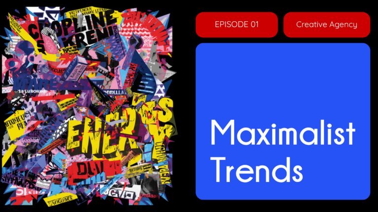
Adobe’s 2026 creative trends forecast closes with one of its boldest calls: Maximalist, Chaotic Layouts, described as controlled chaos and playful unpredictability that Adobe expects to keep trending well beyond 2026. After years of minimalism dominating branding, this trend flips the brief entirely, rewarding heavy layering, bold color clashes, and compositions that look like they could fall apart but never quite do.
What Defines the Maximalist Chaotic Layouts Trend
The trend leans on dense, overlapping visual elements stacked with intention. Expect saturated, clashing color palettes, mixed typography weights and styles crammed into the same composition, and layouts that reject the grid in favor of visual tension. Nothing in a well-executed maximalist design is truly accidental. The chaos is art directed, with every clashing color and overlapping shape placed to guide the eye rather than confuse it.
This sits alongside two other entries in Adobe’s 2026 graphic design trends report, Freeform and Storytelling Layouts and Collage and Layered Visual Elements, all pointing toward the same shift: brands are trading polished restraint for visible, energetic complexity.
Why It’s Trending Now
Maximalism is the latest expression of a pattern we have tracked across 2026’s design trends all year. It is another reaction against hyper-polished, AI-generated visuals, the same underlying force behind trends like Naive Design and Distorted Portrait Design. Where Naive Design signals authenticity through imperfection and hand-drawn imprecision, Maximalist Chaotic Layouts signals it through sheer visual energy and human editorial judgment that an algorithm would smooth over by default. Both trends are ultimately about the same thing: making design feel unmistakably made by a person.
Where This Trend Works Best
Maximalist chaotic layouts thrive in categories built on energy and personality: music and event marketing, streetwear and youth fashion, entertainment and gaming, and editorial or zine-style content. Brands with permission to be loud, playful, or a little irreverent get the most out of this trend. It is a much harder sell for healthcare, finance, legal, and other categories where clarity and trust depend on visual calm. A maximalist layout on a hospital intake page fights the message instead of supporting it.
A Restraint Guide for Brands Experimenting With Maximalism
The biggest risk with this trend is losing the message inside the noise. Keep one visual anchor, whether that is a headline, a product shot, or a logo, that stays legible no matter how busy the rest of the composition gets. Limit the palette to a deliberately chosen clash, not every color at once, and make sure any call to action still reads clearly at a glance. Done well, maximalist chaos feels energetic and intentional. Done poorly, it just feels cluttered. If your brand wants to test this trend without a full rebrand, a graphic design refresh on a single campaign or social series is the lowest-risk way to try it.
Frequently Asked Questions
What is the Maximalist Chaotic Layouts design trend?
It is one of Adobe’s 2026 graphic design trends, defined by heavy visual layering, bold contrasting colors, and controlled chaotic composition. Adobe describes it as controlled chaos and playful unpredictability and expects it to keep trending beyond 2026.
Why is maximalist design trending in 2026?
It is part of a broader reaction against hyper-polished, AI-generated visuals. Brands are using visible complexity and deliberate visual energy to signal human craft and authenticity, similar to trends like Naive Design and Distorted Portrait Design.
What industries work best with maximalist chaotic layouts?
Music, streetwear, entertainment, gaming, and editorial or zine-style content tend to fit best. Healthcare, finance, legal, and other trust-dependent categories generally need more visual calm than this trend allows.
How can brands use this trend without looking cluttered?
Keep one clear visual anchor, limit the color palette to a deliberate clash rather than an unlimited mix, and make sure the call to action still reads clearly despite the busy composition.