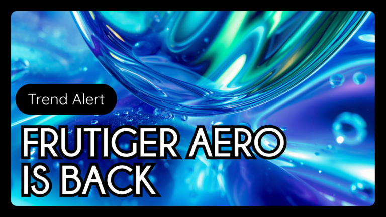
Glossy blue-green gradients, water droplets, and glass-like reflections are back, and this time they have a name: Frutiger Aero. Kittl’s 2026 design trend report calls out Frutiger Aero as one of the year’s strongest comeback aesthetics, and it’s already showing up in social content, packaging, and website design. Here’s what it is, where it came from, and how to use it without it looking dated.
Where Frutiger Aero Came From
The style traces back to the early 2000s, growing out of Y2K futurism and the Web 2.0 design era. Windows Vista’s “Windows Aero” interface, with its glassy, translucent windows and glowing highlights, became a major reference point and helped spread the look across tech advertising, mobile interfaces, and product packaging throughout the decade. The aesthetic peaked around 2007 before flat design took over in the early 2010s and pushed glossy, dimensional visuals out of fashion for over ten years.
What Frutiger Aero Actually Looks Like
- Glossy, glass-like surfaces with soft reflections and highlights
- Blue and green gradient backgrounds that suggest light, air, and atmosphere
- Natural elements, water droplets, bubbles, clouds, leaves, blended directly with technology imagery
- Clean, modern sans-serif typography paired with dimensional icons
- Layered depth and transparency effects instead of flat, single-plane graphics
- Soft, continuous lighting rather than the flat color blocks of minimalist design
Why It’s Coming Back in 2026
After nearly a decade of flat, minimal design dominating brand identities and app interfaces, designers are actively looking for more expressive, emotional visual styles again. Frutiger Aero offers something flat design intentionally strips away: atmosphere, depth, and a kind of optimistic, tech-meets-nature warmth that feels different from the sharp, AI-polished visuals flooding social feeds right now. For brands trying to stand out in a crowded, increasingly AI-generated content landscape, a distinct, nostalgic aesthetic like this one carries real differentiation value.
How to Use Frutiger Aero Without Overdoing It
This is a high-impact aesthetic, which means it works best as an accent rather than a full rebrand. Consider Frutiger Aero-inspired graphics for a limited-run social campaign, a seasonal packaging refresh, or a website hero section, rather than rebuilding an entire brand system around glossy gradients. Pair it with clean, legible typography so the nostalgia reads as intentional and polished rather than cluttered, and keep the color palette anchored to blues and greens so it stays recognizable as Frutiger Aero rather than drifting into generic gradient design.
Frequently Asked Questions
What is Frutiger Aero design?
Frutiger Aero is a design aesthetic built around glossy, glass-like surfaces, blue and green gradients, and natural imagery blended with technology, originally popularized in the mid-2000s and now resurging in 2026.
Is Frutiger Aero the same as Y2K design?
They’re closely related. Frutiger Aero grew directly out of Y2K futurism and the early Web 2.0 era, sharing the same optimistic, tech-forward roots, but it has its own distinct look centered on glass, gradients, and nature imagery rather than chrome and metallics.
Should my small business rebrand around this trend?
Generally no. Trends like Frutiger Aero work best as accents, a campaign, a seasonal graphic, a product drop, rather than a full brand overhaul, since design trends cycle faster than a core brand identity should.
Visuapex Creatives keeps Miami brands current on design trends worth using and the ones worth skipping. Ask us about working Frutiger Aero into your next campaign.