
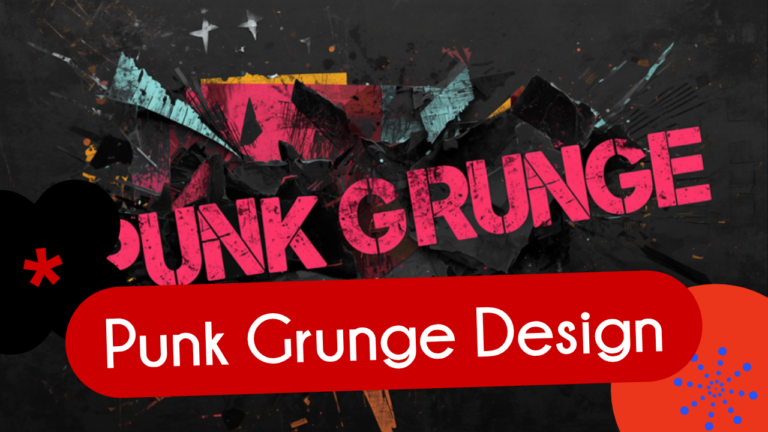
Polished, algorithm-perfect design is losing ground to something rawer. Punk Grunge Design, one of Kittl’s flagship 2026 graphic design trends, is bringing torn textures, chaotic typography, and confrontational color back into branding, and searches for handmade, gritty, imperfect styles are up 41 percent as a result.
What Punk Grunge Design Looks Like
Punk Grunge Design is built on intentional imperfection. Typography breaks conventional rules on purpose, often mixing heavy slab fonts with narrow sans-serifs in the same layout. Grain, scratches, and grit mimic analog printing and photocopying rather than clean digital output. Layouts are asymmetrical and deliberately violate grid structures instead of following them, and collage elements look layered and torn, creating real visual tension instead of smooth, tidy composition. Color palettes lean high contrast, often black and white paired with confrontational neon accents.
Where the Trend Comes From
The aesthetic traces back to 1970s British punk, with Jamie Reid’s Sex Pistols artwork and its ransom-note lettering as a foundational reference point. What’s changed in 2026 is scale: nearly 40 percent of mainstream ad campaigns targeting Gen Z are now using punk visual tactics in some form, moving the look from underground subculture into mainstream brand design.
Why Punk Grunge Design Is Resonating Now
The rise of this trend tracks directly with fatigue around over-polished, AI-smoothed visuals. As more brand content starts to look interchangeable, generated by the same handful of design tools and templates, audiences are responding to anything that feels handmade, specific, and a little rebellious. Punk Grunge Design signals authenticity precisely because it looks like a person made a deliberate, imperfect choice, not an algorithm.
Where Brands Are Using It
Applications currently span album covers, streetwear, and indie branding for categories like tattoo shops and breweries, along with social activism campaigns where a raw, unpolished look reinforces urgency and authenticity. It also shows up increasingly in limited-edition packaging inserts and social content, without requiring a brand to commit to a full visual rebrand.
How to Apply Punk Grunge Design Without Overdoing It
The trend works best as an accent, not a total identity overhaul. A brand can introduce torn-paper texture and ransom-note typography in a single campaign, a product drop, or a social series, while keeping its core logo and color system intact. Kittl offers templates, distressed fonts, and texture overlays built specifically for recreating this look digitally, which makes it accessible without needing a full analog production process. The key is restraint: one or two chaotic elements read as intentional and edgy, while too many at once can just read as cluttered.
This continues the pattern seen across Kittl’s 2026 trend report alongside Naive Design, Blueprint Design, and Trinket Design, each offering a different way to break from the smooth, AI-generated look that dominated the last few years of graphic design trends.
Frequently Asked Questions
What is Punk Grunge Design?
Punk Grunge Design is a 2026 graphic design trend built on intentional imperfection: chaotic typography, torn textures, asymmetrical layouts, and high-contrast neon color palettes inspired by 1970s punk visual culture.
Why is Punk Grunge Design trending in 2026?
It’s a direct response to fatigue with over-polished, AI-generated visuals. Searches for handmade and gritty design styles are up 41 percent, and nearly 40 percent of Gen Z-targeted campaigns now use punk visual tactics.
What industries are using Punk Grunge Design?
Album covers, streetwear, indie branding for tattoo shops and breweries, social activism campaigns, and limited-edition packaging are the most common current applications.
How can a brand try Punk Grunge Design without a full rebrand?
Introduce it as an accent through one campaign, product drop, or social series using distressed textures and chaotic typography, while keeping the core logo and brand colors consistent.